Saturday, 15 August 2015

Colour

I have finally finished the first go at adding colour to my designs on Photoshop.

Pretty happy with the result but I will be going back into Photoshop to add some more layers of shading to add depth and tidy up a bit.


Wednesday, 5 August 2015

More Paintings

Here are two paintings from my third year final exhibition, I had another three paintings in the show but I don't like them anymore so they are not being up loaded.

I am not the biggest fan of these paintings either, I look at them and wish I had done a few things differently but here you go have a look.


Drawing

I was given the task to draw a candy skull owl and after a few attempts I realised that it was a lot harder than I thought it would be, but that I also enjoy drawing candy skull inspired designs.

These are the results of two afternoons. I plan to colour them in on photoshop and have already started one but it is quite time consuming and for the evening I spent on photoshop I was working with a Mac thunderbolt monitor, which was fantastic since I have a tiny Macbook Air, but now the monitors owner has taken it back and I haven't picked up colouring since. But I will finish them, it is just a matter of time. 


Japan

Well I finished uni, and went to teach English in China. I didn't have paints and I didn't have time, what I did have was a camera.

I don't claim to be a Photographer, unlike my father, I don't have the patience and for the life of me can never remember what all the F Stops and stuff does, I set the camera on auto and shoot. I focus on nice shapes and things that interest me. I love photography, and I have spent a whole afternoon in the Welsh mountains messing around with the exposure and F Stops, but when you are in Osaka on holiday with a friend who is already in a bad mood, you don't really want to make things worse by delaying getting lunch by standing in the street taking lots of photos with different settings however, much the cables are making great compositions.

As I am a point and shoot photographer most of my photos are rubbish but out of all the accidental blurred feet photos and traditional touristy shots, I am quite proud of these. But then I was in an incredibly cool city!

Osaka Japan February 2015


Tuesday, 4 August 2015

The Painted Part One

These are more of the Painted series. 

100cm x 100cm

Acrylic on MDF


This one is a different style to the others, I wanted to tone down the marks in the paint and have a softer background, and I have always loved paint drips!

Tuesday, 25 February 2014

Update

Been busy with a history essay and still haven't had any time to paint, but I have continued taking photographs of as many people I can. I have added a guy with big ginger hair and beard, and I have taken my photo for my selfporait which I will be working on this afternoon.

As my selfportrait will be in greys, I am thinking purple greys, I will be working from this black and white image. Until my boards are ready I will be painting smaller and on canvas but at least I can start to experiment with my palette and get painting! Time is ticking away.


Certainly a face with attitude.

Friday, 14 February 2014

Photos

The time has finally arrived.

I am now working on my final exhibition.

Continuing on from last semesters work I am still painting portraits but now I am widening my subject base but limiting my colour palette. My exhibition will be made up of 5 paintings, 1 self portrait which will be in coloured greys and then four other portraits in red, blue, green and yellow.

Now I am looking for people to paint! I took a picture of mates football friend, she has some piercing, cool hair and a rather large tattoo on her arm, took some pictures of my mates band last night and have been sent a picture of a tattooed kick boxer with a beard so it is looking ok so far. I'm still keeping my eye out for people, I think walking around the street and asking strangers may need to happen.

Wednesday, 4 December 2013

An Experiment

I'm an currently working on the fourth painting in my series and the subject in this case unlike the previous three is fair haired and hasn't got a full on beard, which I thought would be easier to paint, but no. I've suddenly become a little to tame and and finding it hard to add texture to the skin, so I decided to leave that painting and do a small experimental study.

I scaled it right down to an A4 sized canvas but used the same palette knife I use on my larger pieces to see what kind of marks and texture I would produce. And here it is.


I lost the drawing, the chin is too pointy and the eyes are little far spaced but there is something rather dreamy about it and I rather like that.

I was also abe to quickly build up texture and working quickly straight onto wet paint allowed the paint to mix together on the canvas creating some nice marks. 

I want to continue some more smaller studies but next time I will improve the drawing and possibly be more abstract by smoothing out some details hopefully to produce some nice pieces. 

Tuesday, 26 November 2013

Beards and Quality Paints

Beards are a pain to paint. And it seems that beards and tattoos are inseparable. However, the palette knife has become my best friend when painting beards, the palette knife and good quality paints. I have for the last few years been ignoring my tutors advice and lectures on the benefits of quality paints, I have been hearing the words 'add to the painting' and seeing my bank account drop very significantly. And with the work I was producing before arguably the paint quality wasn't that important but for my new series I finally took that leap and bought paint, Cryla Artist Acrylics. Why I ever used anything else I don't know. The colours are intense and the texture of the paint is fantastic, thick and smooth, impasto is no longer just a dream anymore, my paintings have life and a a body they never had before helped by the gel mediums I also bought. So now when I block out large blocks for the beard I block out what is underneath and leave palette knife marks behind to give texture and depth making those tricky beard a bit less of a challenge to paint.

The Painted- A new project

The Painted

After some disastrous work, months of frustrated grumbling and pig headed stubbornness I have finally had the 'ah ha' moment I have been waiting for. 

After my boring sense of place project I finally got the courage up to embark on a project that I have always wanted to try- tattoos. Since I was 10 I have loved tattoos, and since I having gotten my own tattoos my interest has only grown. 

However, my enthusiasm for the subject matter just meant I had to many ideas and I jumped from idea to idea, style to style and at the end of the term I had no artwork I felt fully fulfilled what I wanted my work to say. I had some nice graphics, some emotional responses and a load of rubbish. So I went home over the summer and did some thinking, a lot of thinking until I finally thought of an idea. I returned to university with some photographs and some studies and felt better about my third year, the important year, the year with a finally exhibition at the end. I had the notion of painting a portrait and then having the sitters tattoos forming a patterned background, sounds rather simple. 

Three weeks into term and I am already struggling, tattoos are extremely hard to paint, it is not impossible I have seen many artists paint tattoos extremely realistically, but I don't paint photorealistic, I haven't got the patience nor the inclination. In the end I had a nice portrait surrounded by what looked like children's illustrations. I was starting to get frustrated again and I was getting a little panicky thinking of my final exhibition. Then it happened. 

The sky was grey, it was drizzly and I had a 9am. I'm not a morning person, especially when my 9am was a painting workshop and I was starting to get to the point where I didn't want to paint anymore (melodramatic, yes, but I'm an artist) and seeing others surging ahead with their own projects was making me jealous. This workshop was all about artistic responses, our art tutor started the workshop by painting her own response to her journey into work and her morning so far. Watching her work was interesting especially her mark making but it was not this that gave me my sudden inspiration nor was it our task of producing a response to what she had just said, it was what she said that finally gave me my inspiration. 'Do what you want'. That is what she said, very simple and I have been told it multiple times but that's hard to do when what you want to do might not get the right marks in the assessment. She told us of a friend of hers who did what their tutor told them, they believed they were doing the right thing but in the end they didn't get the mark they were expecting and because of this moved on to glasswork and hasn't painted since. Whether that story is true or not it got me thinking, I can't predict what will happen in the assessment, I can't work to a brief, this is university this isn't A-level. I ran home from the workshop, dropped off my paints and went and bought more paints and more board and got painting. I knew what I wanted to do. 

I watched this film once, I can't remember what, I think it was TV movie based on a Stephen King book, but there was an artist in it and she painted these large expressive portraits, I really liked them and the idea never left my mind. I was too caught up with the tattoos that I completely ignored the part that I actually enjoyed to paint, and the most important part, the person. It took 3 days of intense painting but at the end of it I had a painting that I was happy with, that fulfilled what I wanted to say and the start of my new project.


So after this rather long and rather dramatic retelling of the last few months I have a new project I am calling The Painted (working title). I intend the portraits to show the dedication, and skill involved in this much misunderstood art, as well as show the human side and the commitment of the individual who choose to get extensive tattoos. I want to create a colourful series which attempts to project a different and positive side to this sub-culture.

So here is the first painting: 
Title: Adam 
Dimensions: 122cm X 81cm
Material: Acrylic on mount board
Techniques: Palette knife and brush work


Tuesday, 11 December 2012

Works in Progress

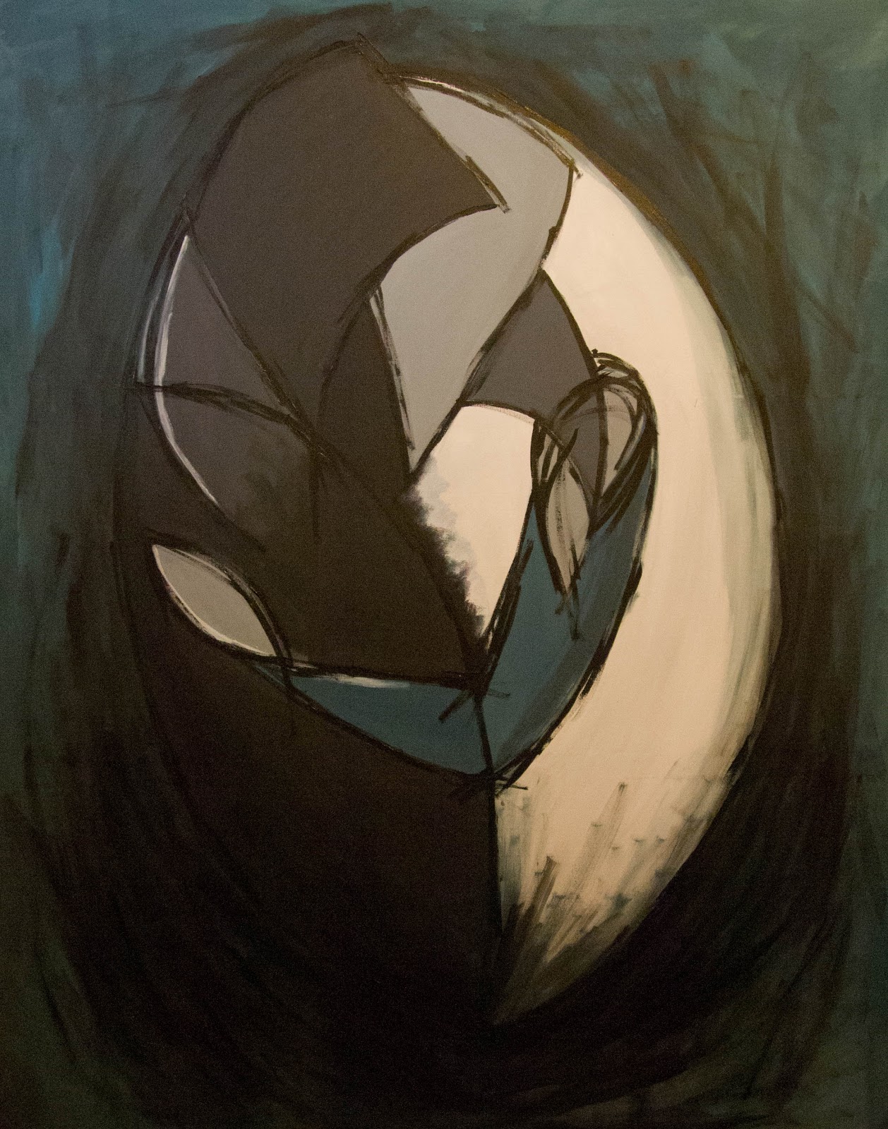
I'm taking a break from my couple embracing and using that style to paint my other charcoal sketches. These two teal canvas are works in progress, and are stuck in the 'what do I do now' stage. Both are based on the same charcoal drawing and focused on capturing movement. After painting my first red painting I looked at both Klimt 'The Kiss' and at the work of Giacomo Balla whose work has inspired me in these paintings.

This was the first attempt at paining the crowd in the same style as my couple and is the outcome of some experimentation. I first started off with just black guidelines and a grey background on which I then added more expressive darker grey paint strokes over the black guidelines, however, that quickly became messy, so in an attempt to clean the painting up I smoothed out the dark grey and painted a section of the canvas that colour, this did two things, it covered up my very dull and badly painted background and gave me inspiration. I then mixed up 3 different shades and painted block shapes to form my background. I then focused on painting back over my guidelines I originally painted and in the end used a palette knife to create some texture.  In this photo is is hard to see the differences between the shades of the background so I may paint over them to create more difference and intensify the colours.


This is the smaller canvas, around the size of a fat A4 piece of paper. With the smaller canvas I feel I can use my Brusho varnish mixture, as on a bigger canvas it would shine too much and be just, well, just too much, but on the smaller canvas it looks nice and creates an intense section. The Brusho mixtures is a nice way to build up subtle layers to show movement which washes of paint just can't quite do, I think it is because thin washes of paint are too thin the brush mixture is thin yet stickier and doesn't bleed unlike washes. Looking at this photo now I feel that either the bottom left corner is to dark or the bottom right corner is to light.


On a Roll

Painting two in my series, and about 6x bigger. This time I used a teal colour instead of red and added some more detail to the shoulder. The overall affect is different from my first one, the red was passionate and intense but this painting is calmer.

Presently this painting is finished but I'm going to look and live with for a few days to see if I feel the need to add any more, but I've worked on it for two days and need a break so I don't go over board.


Thursday, 6 December 2012

Back to Square One

Both vulgar and hands didn't end well. I got bored, unmotivated, and frustrated  so in an artistic strop I picked up my charcoal and drew what I saw in my head out on to paper, and didn't stop!

Thinking about energy and movement I kept my strokes quick and bold over the smudged charcoal yet smooth.  In the first four drawings I focused on the whole crowd, focusing on the shapes I could see stand out from the mass of bodies.


In the next to drawings I focused on one couple I saw in the crowd. I put one photograph into black and white which made shapes bolder and easier to identify and that was when I saw the couple. I really liked the shape they made as a pair, both curved over and into each other the man was dressed in black with dark hair, the girl in white with blonde hair and her arm was holding him joining the two together. So I drew them, at first I didn't like the drawings too much but as I left them up on my wall and I looked at them they grew on me till I could think of nothing but painting them.


In this painting I kept my colour palette limited the red being the only rich statement colour. I added some blue to the greys only to keep them grey from being to bland and flat. But since I wanted movement around the couple but not too much I experimented with mixing Brusho and varnish together and used it to create thin layers over the background and some areas of the figures, much like when I was using the charcoal I used quick free brush strokes for both the varnish mixture and the black outlines.


I'm happy with the finial product. I like the intensity of the colours and the free lines and with how the varnish has turned out as it represents the lights at a concert, however, in my next painting I will probably use less varnish and more washes.


Thursday, 8 November 2012

Get Your Jazz or Should I say Rock Hands Ready!

It was time I got hands on with my painting (I will now stop the silly hand puns) and took some time to actually paint with a paintbrush. I started out by just painting what I saw so using the photograph posted in the last post of my friends hands I sat down to tame the chaos.


Painting hands is hard. I hated it last year when I was painting a long pose but then I had the rest of the body to occupy peoples attention, this was just the hands. Hands are a pain to paint for a number of reasons; 1) the proportions are hard to get right 2) fingers aren't sausages but neither are they lumpy bumpy shapes 3) after staring at hands for a long period of time they start to look really freaky. I did some sketches of the hands before I started on my canvas which helped and then used the paint to add more dimension.

 I used the same paints as the paint party for the paint splashes and am happy with how they turned out. Skin tone is always hard to get and I forgot when I paint I tend to work with pale high contrast colours so the hands are a little neon but I like the contrast with grey and the paint on the fingers. The hands truly stand out. The only problem, apart from the shape of the thumb on the right and the ring finger on the left, is whether or not I should have left the hands floating on the canvas as they are? As it is the painting looks like either a horror film cover or record cover art. However, as observation painting it's not bad.


This painting was an experiment  I drew around my own hands and then using Winsor&Newton Modelling Paste and a palette knife filled in my hands shapes, the two hands at the bottom of the canvas in the foreground, to use arty words, had two layers of the modelling paste to make them stand out more. The paste as a matt effect so when I painted over it not only did I get a nice smudged dry brush affect but the acrylic also dried matt instead of shiny. I then added the metallic paint over the tops in random areas using quick brush strokes to avoid over analysis and controlled movement. I also flicked some paint onto the canvas. I think this has captured the lights at a gig quite well but it is a little messy technically and composition wise. It was a good experiment and I might use elements in my work later on and it has told me I need to work bigger.

Next challenge work bigger and better!
Creating something Vulgar

The definition of vulgar according to Google:

vul.gar

Adjective: 
1. Lacking sophistication or good taste; unrefined: "the vulgar trappings of wealth".
              
 2. Making explicit and offensive reference to sex or bodily fuctions; coarse and rude: "a vulgar joke".

Synonyms: common - coarse - rude - gorss - low - rough - plebeian


After the first meeting with my painting tutor it was decided that I needed to create something vulgar before I could then tame it. By making something vulgar I would be letting loose and by doing that supposedly making something that captured the energy and movement of gigs. However, one big problem hit me in the face as soon as I picked up my paint, I can't let go. I like control I thrive on it! I'm known as a control freak and the idea of making something vulgar went against everything inside of me. I love art work where other artists have made something rough and messy, I like the crash and demonic screams of heavy metal but I can't make something like that. I like smooth clean flowing lines and if I was composing music I like the sweet harmony of strings. So my first attempts at making something vulgar came out as controlled mess that resembled a flat black and turquoise box with bits of masking tape glaring at you as if asking you "what is my purpose here?". 

So I hit the creative wall quicker than I ever had. After sitting and staring at my failed mess with my music turned up my foot tapping I was suddenly hit with an idea. How can you capture and paint something you can't see? So I went shopping...

You are cordially invited to a paint party...
I decided to let the movement and energy capture itself. So I roped in some of my house mates covered my whole room (walls and floor) with plastic decorating sheets and then taped up red wrapping paper, lining paper and some cloth, got so paint ready, donned the painting suit turned the music up and had a party. Once all the paint had been thrown, splattered, smudged and slipped on and we were all covered in it as well we climbed out of the window into the yard (don't worry I'm on the ground floor so there is a drop of 50cm to the floor) and let the paint dry.

Not only did I get some amazing sources to work from I also opened up another path to explore. After we had finished our paint party our hands were covered in paint and it struck me, how many times have hands have been the only thing I can see at a gig now and again only catching brief glimpses at the stage. And covered in paint they seemed to be an interesting idea to explore.

Here are some photos of the paint party and some close ups of the outcome.


A lot of new paths for me to explore so time to get my paint brushes ready!


Thursday, 1 November 2012

'Sense of Place'

Your mission if you choose to accept it: create a body work with a final painting based on the theme 'sense of place'.

Since I am a 2nd year art student and this is the first part of the module I had no choice but to accept the mission. So my mission was to think of something that doesn't involve painting a landscape since I tend to wander when painting a landscape. A painting that is meant to be realistic turns to abstract and I will paint the grass orange as I get sick of green.

Plus when I think 'sense of place' I don't think of an actual place instead I hear music. Yeah I know that sounds kind of pretentious but it's the truth. I'm a music lover, I love everything from classical to metal and everything in between and my i-pod is my most treasured object. When I think of home I think of music, I was brought up listening to my dads punk and rock vinyl till the early hours of the mornings. I link music to books, memories and places.

Therefore I decided that my focus of 'sense of place' would be based on being at a gig or concert, because as cheesey as it may be I feel alive when I go to a gig, adrenalin pumps and you can just let go and enjoy yourself with others who are there for the same reason, plus hearing the music live can be so much better than recorded (only if they can preform live that is!). This sounded great when I first decided to go with it but then I came across my first hurdle; how do you capture the energy that is a central part to a gig on paper? 

I started researching ideas and was influenced by Chuck Close, Rothko and Franz Kline. Even though I went to Download this year and a few gigs in the summer I have no pictures of them so I had to look online for photographs of being in the crowd and from them I did a few sketches using charcoal, vegetable oil and ink. 

These obviously show a little more of the influence of Franz Kline but colour can be added later. And they are the start. Where next who knows?