Tuesday, 11 December 2012

Works in Progress

I'm taking a break from my couple embracing and using that style to paint my other charcoal sketches. These two teal canvas are works in progress, and are stuck in the 'what do I do now' stage. Both are based on the same charcoal drawing and focused on capturing movement. After painting my first red painting I looked at both Klimt 'The Kiss' and at the work of Giacomo Balla whose work has inspired me in these paintings.

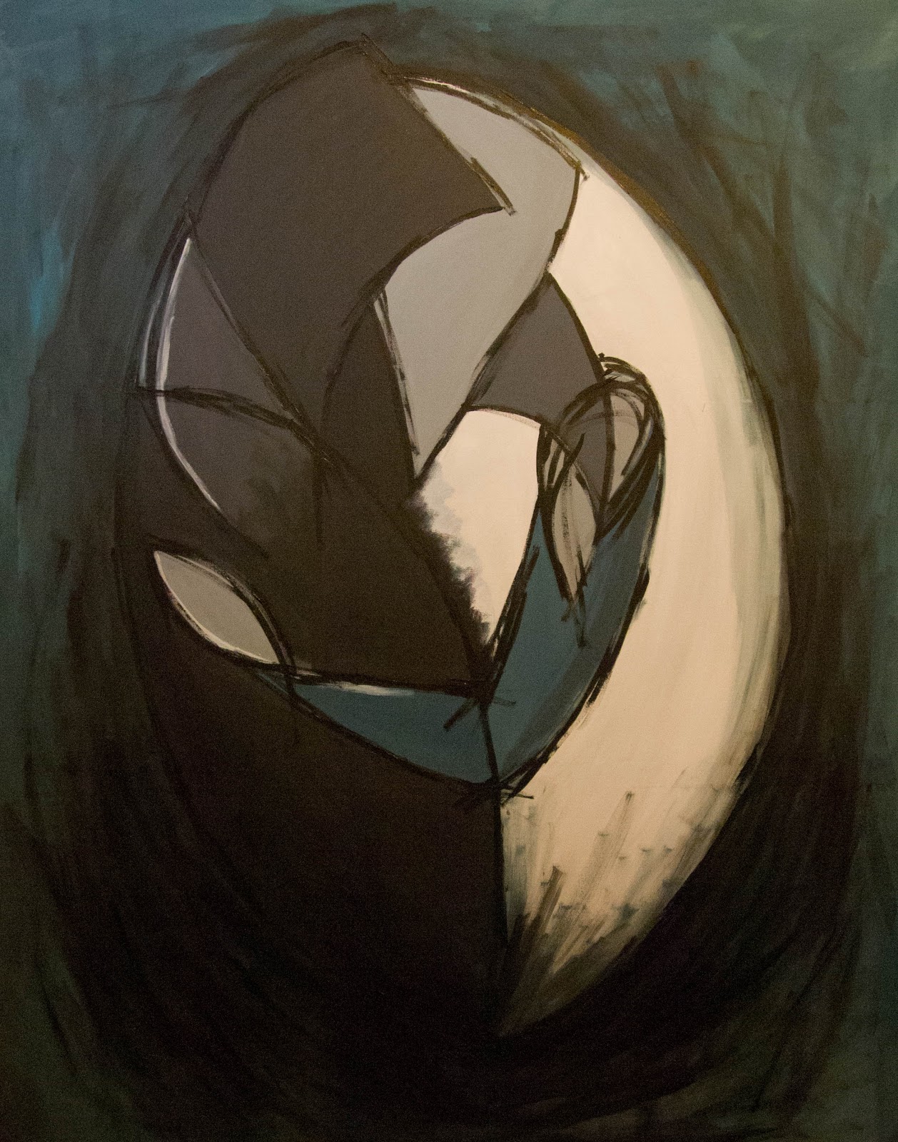
This was the first attempt at paining the crowd in the same style as my couple and is the outcome of some experimentation. I first started off with just black guidelines and a grey background on which I then added more expressive darker grey paint strokes over the black guidelines, however, that quickly became messy, so in an attempt to clean the painting up I smoothed out the dark grey and painted a section of the canvas that colour, this did two things, it covered up my very dull and badly painted background and gave me inspiration. I then mixed up 3 different shades and painted block shapes to form my background. I then focused on painting back over my guidelines I originally painted and in the end used a palette knife to create some texture.  In this photo is is hard to see the differences between the shades of the background so I may paint over them to create more difference and intensify the colours.


This is the smaller canvas, around the size of a fat A4 piece of paper. With the smaller canvas I feel I can use my Brusho varnish mixture, as on a bigger canvas it would shine too much and be just, well, just too much, but on the smaller canvas it looks nice and creates an intense section. The Brusho mixtures is a nice way to build up subtle layers to show movement which washes of paint just can't quite do, I think it is because thin washes of paint are too thin the brush mixture is thin yet stickier and doesn't bleed unlike washes. Looking at this photo now I feel that either the bottom left corner is to dark or the bottom right corner is to light.


On a Roll

Painting two in my series, and about 6x bigger. This time I used a teal colour instead of red and added some more detail to the shoulder. The overall affect is different from my first one, the red was passionate and intense but this painting is calmer.

Presently this painting is finished but I'm going to look and live with for a few days to see if I feel the need to add any more, but I've worked on it for two days and need a break so I don't go over board.


Thursday, 6 December 2012

Back to Square One

Both vulgar and hands didn't end well. I got bored, unmotivated, and frustrated  so in an artistic strop I picked up my charcoal and drew what I saw in my head out on to paper, and didn't stop!

Thinking about energy and movement I kept my strokes quick and bold over the smudged charcoal yet smooth.  In the first four drawings I focused on the whole crowd, focusing on the shapes I could see stand out from the mass of bodies.


In the next to drawings I focused on one couple I saw in the crowd. I put one photograph into black and white which made shapes bolder and easier to identify and that was when I saw the couple. I really liked the shape they made as a pair, both curved over and into each other the man was dressed in black with dark hair, the girl in white with blonde hair and her arm was holding him joining the two together. So I drew them, at first I didn't like the drawings too much but as I left them up on my wall and I looked at them they grew on me till I could think of nothing but painting them.


In this painting I kept my colour palette limited the red being the only rich statement colour. I added some blue to the greys only to keep them grey from being to bland and flat. But since I wanted movement around the couple but not too much I experimented with mixing Brusho and varnish together and used it to create thin layers over the background and some areas of the figures, much like when I was using the charcoal I used quick free brush strokes for both the varnish mixture and the black outlines.


I'm happy with the finial product. I like the intensity of the colours and the free lines and with how the varnish has turned out as it represents the lights at a concert, however, in my next painting I will probably use less varnish and more washes.